Writing Planetfall 2: Children of Fall

At long last I have finished and published Children of Fall, the second book in the Planetfall trilogy. Phew, and Yay!planetfall 2 title graphic

In this blog, I’m going to take you behind the scenes of the novel. I’ll show you some of the process in building the story, writing the first draft, how early (constructive) criticism changed the novel between the first and final draft, and then explore the journey to creating the cover art.

First, if you haven’t seen the book online and want to buy it, then paperback and Kindle options are on the links below:

Buy paperback or Kindle (Amazon)

Buy paperback (not Amazon)

Conceiving the story

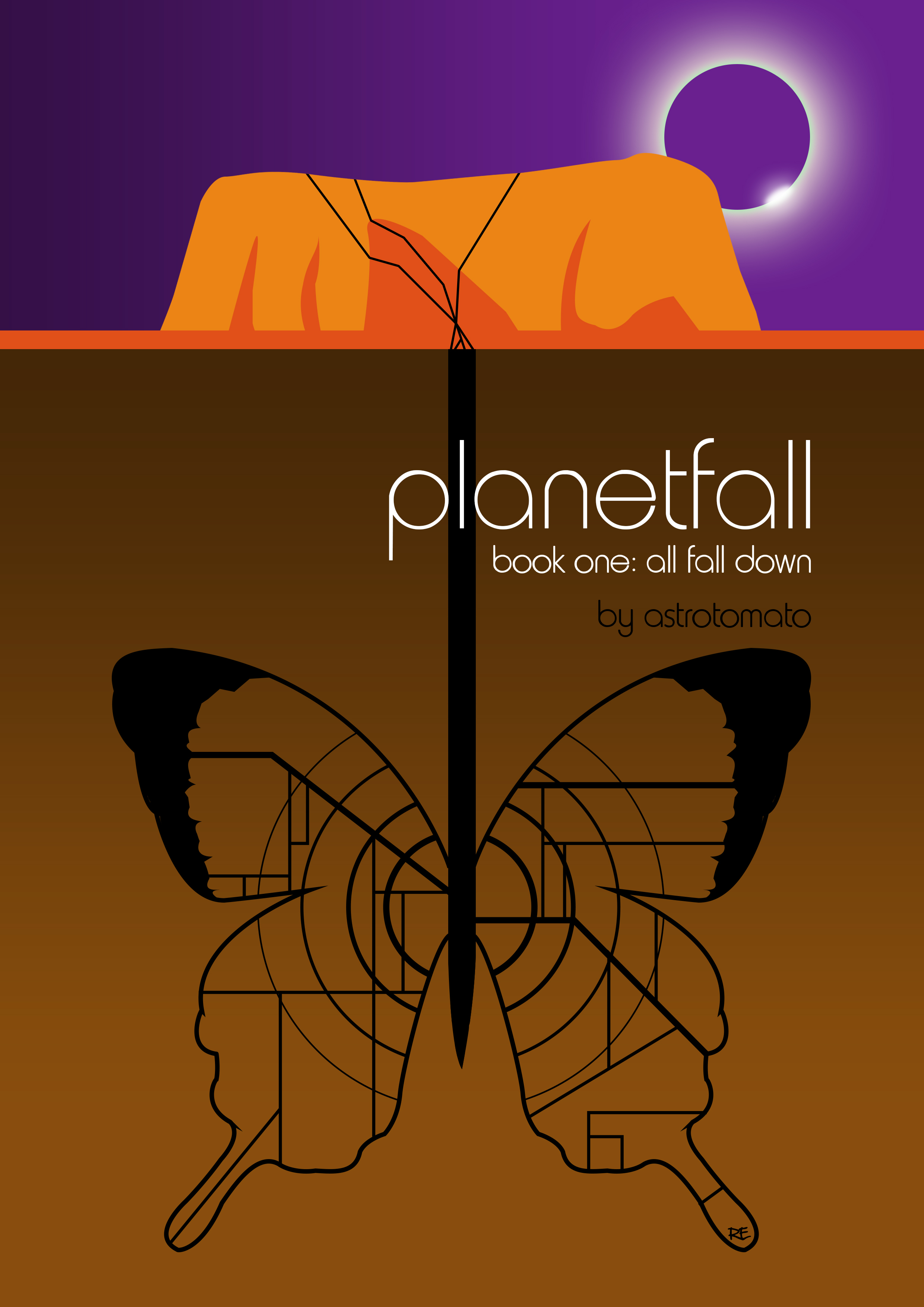
Children of Fall has taken ten years to write, and is the biggest and most complex book I’ve ever written. I first conceived the story in 2007, and realised by 2008 that I didn’t have the skill as a writer to bring to life the story in my head. It probably took me about 65,000 words of writing, scrapping material and re-writing to come to this conclusion. There also seemed to be a lot of back story to get the reader to a point of understanding the story I wanted to tell, which forced me to a logical conclusion: I needed to write another novel first, something simpler and more straightforward, to set the scene. This became Planetfall book 1: All Fall Down.

The starting point of Children of Fall (and the whole Planetfall series) was inspired by Quatermass and the Pit, an old science fiction film in which an astronaut returns to Earth, infected with alien DNA. I didn’t so much want to re-tell that story, as use it as a point to jump from: what if a soldier on the front line of a war became infected with alien DNA? How would that soldier be treated? What might that soldier become?

Thoughts about DNA suggested a structure for the novel: there would be two stories, intertwined, like the double-helix of DNA. At points they would come close and at others they would spiral apart. This meant writing two separate stories, side by side, which occupied the same universe and the same overall narrative, but which had their own characters and viewpoints.

After writing All Fall Down, a process which took 3 years, I tried to write Children of Fall again, and failed again. I was committed to the story structure – I could see it in my head – but I couldn’t make it happen on the page.

The next book I wrote was Backpackers, a romantic fiction novel about young people backpacking through south east Asia. The structure of that novel is of a series of short stories, each based on a different character, but who all come into contact with the book’s protagonist, Cath Pearson. Each story comments in some way on that central character, so we see slices of her drama. This let me build my skills in writing from different characters’ points of view, letting a longer narrative play in and out of other stories, and getting it all to make sense. I was building my writing muscles: first, I had written a novel from start to finish in the universe I wanted, and then I had written a novel with a similar structure to the one I wanted to write.

After those two novels were finished, I made my next attempt, and managed to write a decent amount of a first draft. But the story at that point was different to what it is now. I started with the former inhabitants of Fall being refugees, aboard their own starship, and committing piracy to stay alive. They wanted revenge on their former colony administrator, and kidnapped Kate Leland in the hope she would be their leader. Kate also started out at a different point in her life: an embattled war General, who steals an old ship to house the refugees and let them hide beyond military sensors. The other main character, Swan, had something closer to a hero’s journey. He even tracked down Daoud at one point, and tried to kill him. You won’t see anything of this in the new novel, and once you’ve read it, you’ll wonder how the finished story could even have included the above.

Receiving criticism and re-plotting

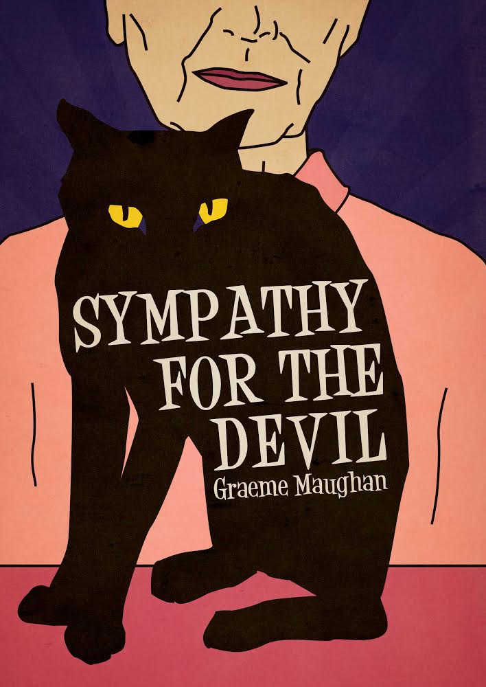
With that first draft in hand, I put the draft novel to one side, intending to come back to it a month later. Events overtook me: the UK’s former Prime Minister Baroness Thatcher died, and a story idea came to me. I have written about that on this blog, suffice to say the month became somewhat longer, until another couple of years had gone by. I released that new book, Sympathy for the Devil in 2015, and returned to Children of Fall.

I tidied up the draft and sent it to a trusted beta reader. His feedback contained the catalyst for scrapping most of the first draft (again!) and re-writing almost from scratch. Amongst two pages of feedback on individual chapters, lines, typos and overall story commentary, he wrote this:

“I didn’t get much of a sense of Kate this time around. I remember last time thinking she was fully formed and focussed as a character. This time she seems less focussed, except maybe at the start, when she steals the ship and goes to fall. I didn’t really get the grand plan she had to stop the war.”

When I started to unpick Kate, and try to understand why this might be, the entire plot fell apart. This comment proved to be the single thread that causes a carefully knitted garment to unravel. Out went the ship stealing (too aggressive), out went the grand plan (too vague, obviously, but too organised as well – it took away the dramatic tension). Importantly, I took that comment on her having “less focus” [sic] and used it, completely re-imagining where Kate might be a dozen years after the first book. Kate is less focused from the start of the book now, but she is deliberately out of focus: even she doesn’t know who she is. Indeed our first view of her is as a hologram, unreal, made of light, gone at the flick of a switch. As the book goes on, and events unfold, a new Kate emerges and comes into focus. But even at the end, we don’t fully understand who she is. And neither does Kate. She’s someone who has lost touch with herself, who is running away, and who needs to make a decision: does she keep running, or does she commit to something bigger?

I want to make the point, which I think is fairly clear, that early drafts of books need criticism, they need objective viewpoints to force us to think differently about our stories. No story, no novel, can be any good without feedback and criticism at different stages.

Developing the plot

Having an idea about a soldier who becomes infected with alien DNA is all well and good, but how do we find the story around it?

All Fall Down gave me the space to find the alien DNA: it was in place at the start of Children of Fall. The moment of infection I also had early on – without going into spoiler territory, I very much wanted a scene like one you would find in a superhero comic. But it also had to feel real and believable.

I was helped in this by some feedback on an early chapter I took to my writing group. In the early draft, Swan invades a ship and comes face to face with the alien enemy. The aliens are described, and a battle ensues. At my writing group, I was given a throwaway suggestion: don’t ever let us see the aliens, so that they have more power. This led down two paths. The main alien enemies in the book are never seen. They’re referred to, and the most description we get is that one species is “lemur-like”. Beyond that, they’re ever-present, never seen, yet a constant threat.

At the other end of the scale, I thought it would be good to bring back the aliens from All Fall Down. Ones so large, so gargantuan, that their sheer scale would induce numbness in the reader. Not horror, not awe, but something too big to be human, humanised or understandable. A numb, blank spot in the story, around which Swan spirals. The opening lines of the book are deliberately meant to reference this effect, where Swan talks about memory wipes, of feeling like his head is full of snow and ice, of feeling blank. It foreshadows what is to come, and also links us back to Kate in All Fall Down, when she wipes a key character’s memory.

Dehumanisation is a key theme of the book. We find many of the characters losing their humanity and their empathy as the book progresses. Children are grown to become soldiers; not only is every character flawed, but many of them are actively trying to avoid humans or otherwise send them to their deaths. Marines are clad in organic battle suits, looking “monstrous”, like something that has “crawled out of a swamp”.
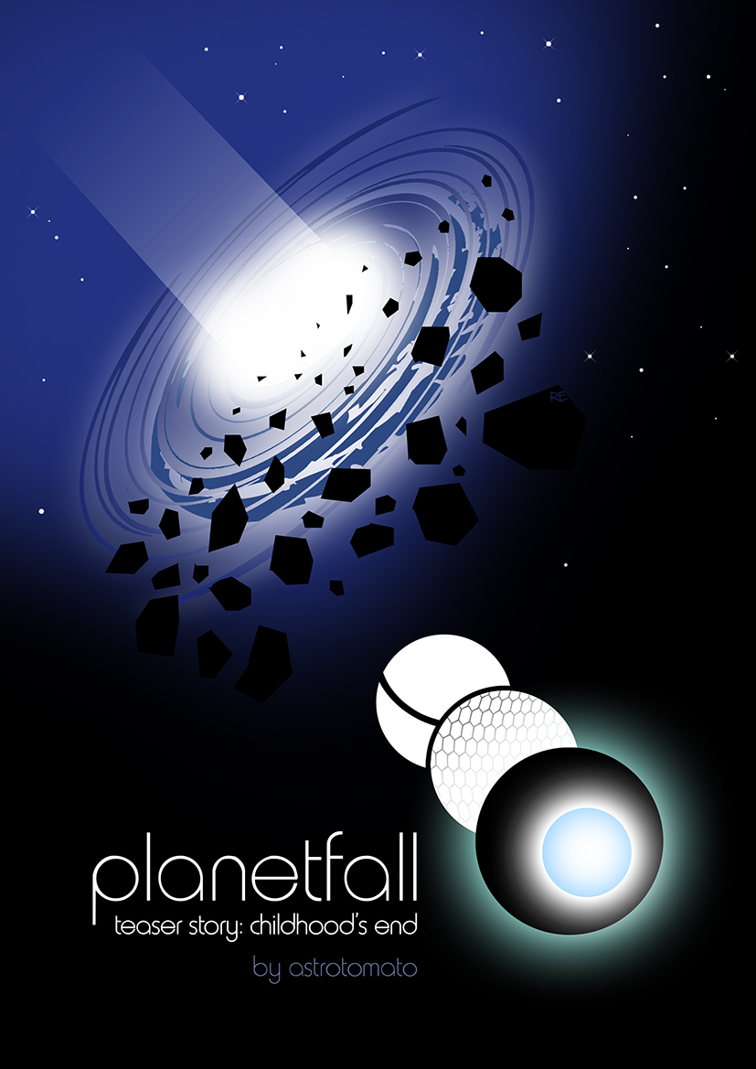
Cover art

I start the cover art process by throwing a lot of visual ideas at my cover artist. These will be images that I might have used as inspiration for certain scenes or characters, or that helped me with mood or feel or emotion.

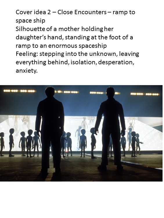
Below you can see some art work that covers space scenes, classic scifi UFO-type art work, some panels from Swamp Thing, and two book covers.

cover dev 1cover dev 2

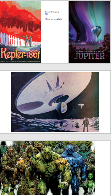
Accompanying these visual ideas is a summary of the story, key themes in the book, character profiles and any particular scenes that help to bring the story or character to life.

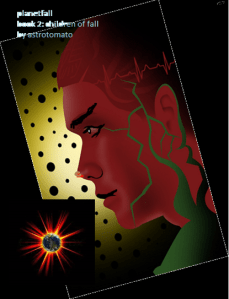
Rob, who produces the Planetfall covers, then works on an outline cover idea. This [below] was an early draft. At this point I give constructive feedback, which again takes the form of both written comments and visual ideas.

Original Children of Fall cover idea

Children of Fall draft cover idea

Below are images I sent back along with my feedback on the cover art. The overall comment was that the cover needed more drama and more contrast.

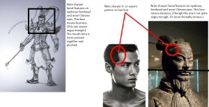
In the images above you can see some specific images connected with hairline (top-left). There are also images connected with the texture of the mutation creeping up Swan’s face (top-right and bottom-left: ‘Mutation’ by Tom Stewart).

The top-middle image shows the draft cover angled over, with an exploding asteroid or sun in the bottom left-corner, a suggestion towards the need for more drama.

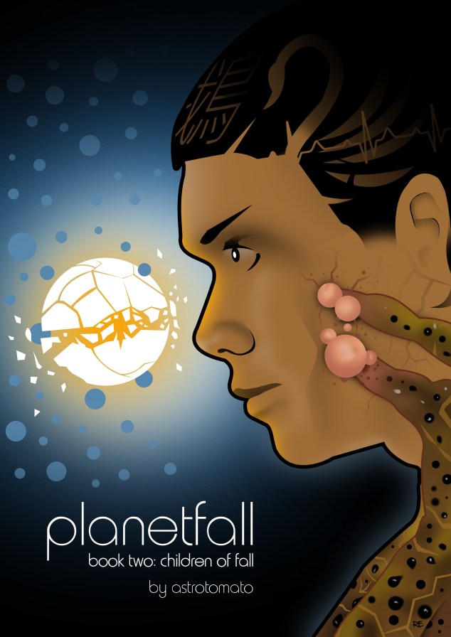
Out of all this comes the final cover image:

planetfall 2

Win a copy of Sympathy for the Devil!

To celebrate the publication of my new novel Sympathy for the Devil I’m giving away two paperback copies.

To enter this competition simply Like the book’s Facebook page. It’s that simple.

Here’s the link:

https://m.facebook.com/SympathyNovel

Good luck,

astro x

Working with cover artists – part 2 – watching the cover evolve

In my guest blog for Lucy Hay on working with cover artists to get your self published book looking exciting and marketable, I talked about inspiring the artist and respecting their decisions.

In this blog I want to expand on where I did that well, and where I did that less well. Fortunately I ended up with great pieces of art in both cases, because of the talent of the cover artists. The process of reaching the eventual cover is important, because (a) you might want to work with that designer again, (b) how you approach the artist will influence the quality of work you get back, and (c) if you have a dispute or need more draft work done than expected, you need to have invested in the artist in advance so that they’re more willing to be flexible.

First, an example of where I approached the cover art commissioning process poorly.

Planetfall – Childhood’s End

I’m lucky to work with Rob Ellis of @moviessimple on the Planetfall covers. For the cover to book 1, I followed the rules properly – I gave Rob some key scenes and imagery from the book and gave him free rein. The image he came up with isn’t something I could have ever envisaged:

Planetfall_cover_final

Planetfall: All Fall Down, final cover image, (c) Robert Ellis 2013

I think I only asked for one tweak to this image. Rob did an amazing job of interpreting what Planetfall: All Fall Down was centred around, and my fondness for graphic design and the scifi art of the 1960s and 70s, and came up with something that will stand the test of time in artistic terms.

When it came to the teaser story Childhood’s End, I had a pretty strong idea of what the cover “should” look like. And that’s the first and most fundamental mistake.

Instead of following my own advice, I told Rob that I wanted the cover to be one of two things. Either silhouettes of a mother and daughter boarding a spaceship, or a ship heading towards a wormhole. I’ll take you through the Powerpoint file I sent him so we can see what was good and where it went bad.

Slide1

This is the first slide. This starts well. It simply sets out the inspiration for a key scene in the story, and helps set out a vision. The next slide is where I over-stepped the mark and turned into a dictator. I’ll show you why further down, but first I’ll continue sharing the Powerpoint slides to show how my mistake became compounded.

Slide2

Yes, I put together a mock-up of a cover, outlining the colouring, positioning and design I wanted. This is far too dictatorial. I built on this mistake with these two slides:

Slide3

Slide4

We start here with another inspiration image, which wouldn’t be too bad if I hadn’t then produced another mock-up of a book cover below:

Now Rob being Rob was very nice and came back to me saying he felt the ship front cover was the stronger image. And so he set to work. And this is was his first draft.

planetfall childhood (1)

Planetfall: Childhood’s End draft cover image, (c) Robert Ellis 2014

This looks remarkably similar to the mock up I produced. And it’s not a strong enough image. And the reason for that? Because I dictated what I wanted it to look like. Rob did his best with a very narrow and overly-specified commission.

Fortunately we worked together to re-imagine this and work towards the eventual cover, which combines elements of the two ideas. And while the outcome is great, I know that for the cover to the next Planetfall book (“Children of Fall”) I’ll be stepping back and letting Rob design something from scratch. I will share some imagery that’s inspired me, and give him access to the book and key scenes, and that’s where I’ll stop, because that leads to a more productive and happy relationship.

Final image:

childhoods end FINAL1

Planetfall: Childhood’s End final cover image, (c) Robert Ellis 2014

Sympathy for the Devil

Suffice to say I learned from the mistakes I made on Childhood’s End, and went back to my original approach of simply inspiring the artist for Sympathy for the Devil.

Bodil Juline had an artistic style (which you can see here) which I felt really captured the tone of Sympathy – comic book, with elements of design and fun. For me, Sympathy for the Devil is a cartoon caper. It’s a little old lady being chased around London by demons and Margaret Thatcher. It has a serious message in it but it’s also utterly ridiculous, and I wanted that feeling of comic book fun to translate into the cover.

Let me take you through the imagery I shared with Bodil to help inspire her, and then the drafts she came back with and the feedback I gave.

Initial imagery I shared:

Black cat    evil-black-cat-tattoo-design

These were images for Sam the cat, to get a sense of his black evilness and his cartoon villainy.

These pics were images I’d looked at for Lucy, the main character:

Dot cotton 2

Fur cape

psychedelic dress

Lucy was always modelled a little bit on Dot Cotton from Eastenders, but I also wanted Lucy to be a little bit like Holly Golightly from Breakfast at Tiffany’s, as if she’d just grown old but never really changed.

And a final few images:

custom pop art printed on canvas

custom pop art printed on canvas

o-MARGARET-THATCHER-HANDBAG-570

Pink Panther

Here we have a picture of Margaret Thatcher, a major presence and character in the book – and whose styling Lucy emulates. And two pieces of art. First a Roy Lichtenstein for the pop-art element, and finally the 1960s cartoon styling in the Pink Panther advert. Note the elements similar to Holly Golightly – the cigarette holder and the upper class style.

The big issue here is that I didn’t give any comments about what the cover should look like. I simply shared the images I’d used, and the styles I liked.

So here’s the first draft cover that came back:

lucyandsam-01

Sympathy for the Devil initial draft cover image, (c) 2015 Bodil Juline

Note how all the elements are drawn together.With this we could enter a more productive relationship of feedback and drafting. My first feedback centred around the following comments: could there be more contrast in the colours, and could we keep Lucy’s face more mysterious – following established advice that a face helps sell covers, but the whole face shouldn’t be shown. (This face is also, of course, Dot Cotton from Eastenders, so we had to find a way of disguising that slightly.)

Bodil came back with a couple of fresh drafts:

samdraft-01

Sympathy for the Devil draft cover images, (c) 2015 Bodil Juline

sampinkpanther-01

Note the colour variations and the stronger use of Sam the cat, whose eyes draw you in.

We talked about the background and foreground colours, and went with this as the next draft. Here Lucy has lost her fur, because the artist felt it didn’t look right, so I went with her decision.

Sympathy almost final

Sympathy for the Devil penultimate draft of cover image, (c) 2015 Bodil Juline

This is almost finished. I shared this image with a friend who works in graphic design, who gave me two pieces of technical feedback. In the final image you’ll see that the font is slightly smaller, and Lucy has an enigmatic Mona Lisa smile. Lucy’s upper face is missing, so we don’t have her eyes to work out what that enigmatic smile means. But we do have Sam’s eyes – and in the novel Sam is her familiar. So what we see on the front cover is now a clue to the book and Lucy’s character.

Here’s the final image:

COVER FINAL

Sympathy for the Devil final cover image, (c) 2015 Bodil Juline

Sympathy for the Devil – cover reveal & publication date

My new novel, Sympathy for the Devil, will be published on 10 September! Here’s the synopsis:

Margaret Thatcher has come back from the dead, and this time she’s got a challenger. Get ready for a fight for the Mother of All Parliaments. And her opponent?

68-year old Lucy is Margaret Thacher’s personal maid. When the former Prime Minister dies, Lucy suddenly finds herself with nothing to do and only a meagre pension to live on. But soon she’s thrust into a world of politics between a moribund Left Wing and a resurgent Far Right Wing. She must battle dragons, rent boys, dead clowns, symbols of a mythical pure England, and worst of all – ambitious politicians.

In the end, Lucy has to ask herself: will she save Britain from its own corrupt politicians? And will you want her to win?

Sympathy for the Devil is in equal parts comedy, fantastical tale of demons and rollicking action-adventure. The main character is a little old lady, Lucy, who is aided and abetted by her talking cat, Sam. Together they negotiate the perils of retirement while desperately trying not to face up to the truth: that Lucy, old, knackered, wrinkly, a drug addict and in desperate need of a nice sit down and a cup of tea, might just be the Antichrist.

To lead into publication, I am proud to reveal the cover art! It was put together by the very talented Bodil Juline, whose work you can view and buy on her etsy shop here: https://www.etsy.com/shop/talksoftlypleaseSympathyCoverArt_final

Sympathy for the Devil will be available for pre-order on Kindle from 17 August, and released in paperback on 10 September. Tune in for more details about how to get your copy!

astro x

Writing update

Busy times! Life has been hectic since my last blog post in … September?! Blimey.

Since September, I’ve completed the following writing:

Sympathy for the Devil is complete, formatted, reviewed by my brilliant beta readers, and is now out looking for representation. So far it’s been to 30 different literary agents, and I’ve received rejections from 11 of them. Eighteen never responded – I assume these are therefore rejections – and I am waiting to hear from one more agent. A lot of the responses from agents have been personal and very positive. There’s been a couple of ‘form rejections’ (those where it’s clearly a standard letter saying thanks-but-no-thanks). The personal responses were very heartening, essentially saying, “Yep, it’s strong enough, the writing is there, but it’s not right for our particular agency.” I love these responses.

All of the submissions I’ve made so far are to agents who accept e-submissions. I haven’t sent Sympathy to any agency that demands a printed submission. I think it’s a waste of paper and money. The author has to pay for printing and postage, and the agency has to pay for disposal costs later (if the author hasn’t paid for a return SAE). It’s so outdated and wasteful as to be laughable. I imagine literary agencies with piles of paper, towers of mulched wood and ink surrounding poor graduates. When instead they could simply transfer a Word doc to a Kindle and read submissions anywhere.

In September I also wrote a short story, Maisy & Jim. I sent it to a literary magazine, which duly rejected it. I will be keeping it on file for a later short story collection, I think.

Currently I’m working on Planetfall 2: Children of Fall. The action picks up twelve years after the events in All Fall Down. Kate Leland is now a Fleet Admiral. The war that Daoud started is still going. And… that’s as much as you’re getting. I’m about halfway through the first draft now, and hope to have that completed in August.

I am also editing another book for Tara Basi (Masterminders, Blocks), and may have some more editing work upcoming for a scifi novel.

On top of that, we’re also moving house soon and having a baby!

Phew.

astro x

New Planetfall story available

Hi all,

I’m really pleased to say that I have a new a short story available on Friday 29 August, which fits into my planetfall trilogy.

For those of you who read Book 1: All Fall Down, you will recall that it centred around Kate Leland, a Military Intelligence General who is tasked with identifying if a military scientist has been killed by (and therefore made first contact with) aliens. Kate’s investigations on the planet Fall lead her to discover a plot to de-stabilise the peaceful society she lives in. At the end of the book, her greatest dream comes true: she makes first contact, and it turns into her worst nightmare.

The new short story takes the very end of the book as its springboard, and twists it somewhat. You don’t need to have read Book 1 to read the short story, because all the characters are new, and some of them will become major characters in Book 2 when it’s on release at the end of 2015.

You can order Planetfall: Childhood’s End on the following platforms:

Amazon Kindle

iTunes (link coming soon)

Lulu

The cheapest source is Amazon Kindle, which is due to a clash between Amazon and Lulu’s pricing rules, which I will cover in another blog. For the moment, enjoy the lovely cover art by Planetfall cover artist Rob Ellis (@moviessimple on Twitter) and I hope you enjoy the story.

childhoods end FINAL1

All the best,

astro x


Pricing rules for e-books, a rant

Hi all,

a rant on today’s blog.

In early September I am publishing a short story in my Planetfall scifi trilogy. I’ve made it available on Amazon, Lulu, iTunes, Kobo and some other platforms. Primarily, it is published via Amazon KDP and Lulu, and Lulu distributes to the other platforms.

Because it’s a short story, I have priced it very low. Let’s deal with why I’ve priced it first. My writing is not a hobby. It is a second job. I put a lot of effort and time into it, and I run at a loss on it: cover art costs money, ordering paperbook proofs for physical distribution costs money, I miss out on time with friends and loved ones, and people access and enjoy what I create. I think it’s OK to be paid for that.

Now, pricing. It’s a short story, just under 10,000 words, so I want it to be affordable. After some research on what short stories are selling for, I decided on a pricing point of 77p (about US99c). This matches the price of other short stories on Amazon Kindle, and is below the 99p that Shortfire Press charges (note: I agree with their pricing policy, but I am competing with the market conditions on Amazon). So far, so so sensible. A work in an established science fiction series, it’s price matches the market, and the royalty I make is about 24p. A tiny amount, but at least it’s something for the 3.5months of development time.

So what’s the problem?

On Lulu I priced it the same: 77p. And I ticked the options to distribute to iTunes, Kobo and the other markets to which Lulu gives you access. Unfortunately, due to licensing agreements, Lulu drops the price on other platforms. So a 77p list price on Lulu drops to 49p elsewhere. OK, so what?

Here’s the rub. Amazon demands that books sold through its platform can’t be priced higher than the same book available through other platforms. Their solution is to give you a few days to re-adjust the price, otherwise they block your book.

I went back to Lulu and tried to figure out the pricing differential. I raised the Lulu list price by 26p, so that 49p + 26p = 77p. Bingo? Not bingo 😦

Lulu’s licensing agreements means that its distribution to other platforms goes at two pricing points: 49p, then 99p. There’s no in-between.

This means (sigh) I have to make a decision: raise the price on Amazon above the point set by the market, or just have Amazon the cheapest.

It doesn’t seem fair to readers on other platforms to keep the Kindle version as the cheapest. And I also know that being relatively undiscovered and pricing myself above the rest of the (Kindle) market could backfire and result in fewer sales: Kindle is still where I sell most of my books.

I suspect I am going to have to raise the Kindle price at some point though.

What I find annoying about this is that I want to get my work to readers on whichever platform they’re using, and to ensure that the pricing is fair and consistent and fits into the prices the market has settled on. But I am falling foul of the distribution platforms putting in rules that force me to either lose readers or favour one set over another.

Well, that’s today’s rant. I’d be interested if other self-published authors have come across the same issue.

Hope your writing is going well, as ever,

astro x


Planetfall teaser story

Hi everyone,

In the next couple of weeks I’ll be publishing new material in my Planetfall trilogy. This is the first extension to Book 1: All Fall Down since it was published in early 2013.

I’m really excited!

The teaser story isn’t Book 2 in the trilogy. That will come out towards the end of 2015 (or at least that’s the intention). The teaser is an integral part of the story, however. It is a small slice out of the normal realm of the Planetfall world you know from Book 1, and it introduces key characters into the Planetfall universe. Importantly it builds on the emotional themes of Book 1 – desperation, standing on the edge of world changing events, anxiety – and brings more texture and depth.

To ensure the teaser fits into the rest of the Planetall trilogy, it will come with its own book cover art work.

I’m building up to publication via the trilogy’s Facebook page. All the posts are connected to the story somehow, either by selecting imagery, technical issues for the scifi geeks, or emotional themes. Please ‘Like’ it to get exclusive news – I’ll be unveiling the cover art on there when it’s ready.

I hope your writing and reading is going well. Remember you can find me on Twitter @astrotomato, it would be great to hear from you.

Best wishes,

astro x