

In my guest blog for Lucy Hay on working with cover artists to get your self published book looking exciting and marketable, I talked about inspiring the artist and respecting their decisions.
In this blog I want to expand on where I did that well, and where I did that less well. Fortunately I ended up with great pieces of art in both cases, because of the talent of the cover artists. The process of reaching the eventual cover is important, because (a) you might want to work with that designer again, (b) how you approach the artist will influence the quality of work you get back, and (c) if you have a dispute or need more draft work done than expected, you need to have invested in the artist in advance so that they’re more willing to be flexible.
First, an example of where I approached the cover art commissioning process poorly.
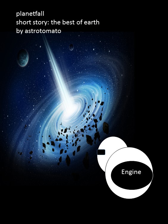
Planetfall – Childhood’s End
I’m lucky to work with Rob Ellis of @moviessimple on the Planetfall covers. For the cover to book 1, I followed the rules properly – I gave Rob some key scenes and imagery from the book and gave him free rein. The image he came up with isn’t something I could have ever envisaged:

Planetfall: All Fall Down, final cover image, (c) Robert Ellis 2013
I think I only asked for one tweak to this image. Rob did an amazing job of interpreting what Planetfall: All Fall Down was centred around, and my fondness for graphic design and the scifi art of the 1960s and 70s, and came up with something that will stand the test of time in artistic terms.
When it came to the teaser story Childhood’s End, I had a pretty strong idea of what the cover “should” look like. And that’s the first and most fundamental mistake.
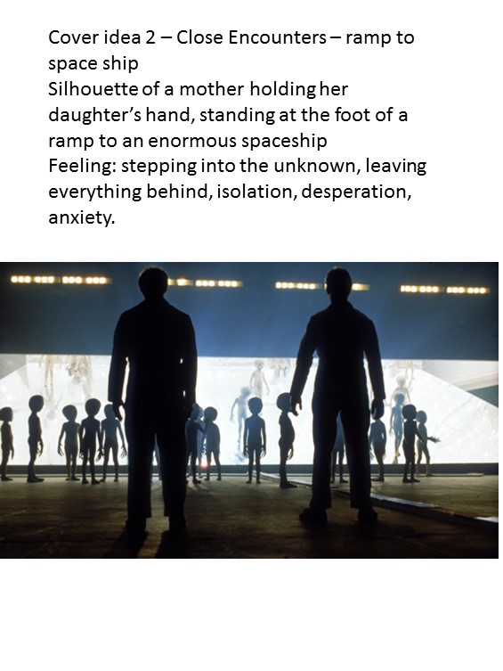
Instead of following my own advice, I told Rob that I wanted the cover to be one of two things. Either silhouettes of a mother and daughter boarding a spaceship, or a ship heading towards a wormhole. I’ll take you through the Powerpoint file I sent him so we can see what was good and where it went bad.

This is the first slide. This starts well. It simply sets out the inspiration for a key scene in the story, and helps set out a vision. The next slide is where I over-stepped the mark and turned into a dictator. I’ll show you why further down, but first I’ll continue sharing the Powerpoint slides to show how my mistake became compounded.
Yes, I put together a mock-up of a cover, outlining the colouring, positioning and design I wanted. This is far too dictatorial. I built on this mistake with these two slides:

We start here with another inspiration image, which wouldn’t be too bad if I hadn’t then produced another mock-up of a book cover below:
Now Rob being Rob was very nice and came back to me saying he felt the ship front cover was the stronger image. And so he set to work. And this is was his first draft.
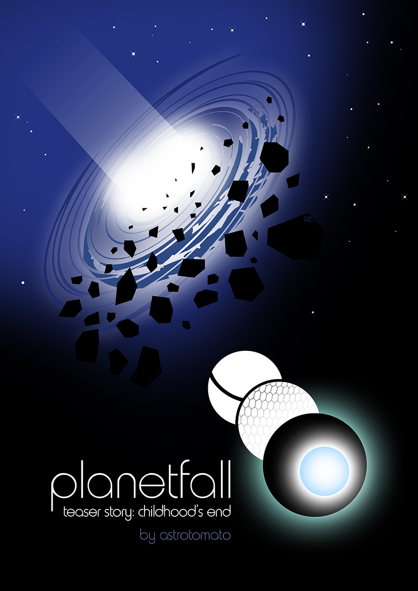
Planetfall: Childhood’s End draft cover image, (c) Robert Ellis 2014
This looks remarkably similar to the mock up I produced. And it’s not a strong enough image. And the reason for that? Because I dictated what I wanted it to look like. Rob did his best with a very narrow and overly-specified commission.
Fortunately we worked together to re-imagine this and work towards the eventual cover, which combines elements of the two ideas. And while the outcome is great, I know that for the cover to the next Planetfall book (“Children of Fall”) I’ll be stepping back and letting Rob design something from scratch. I will share some imagery that’s inspired me, and give him access to the book and key scenes, and that’s where I’ll stop, because that leads to a more productive and happy relationship.
Final image:

Planetfall: Childhood’s End final cover image, (c) Robert Ellis 2014
Sympathy for the Devil
Suffice to say I learned from the mistakes I made on Childhood’s End, and went back to my original approach of simply inspiring the artist for Sympathy for the Devil.
Bodil Juline had an artistic style (which you can see here) which I felt really captured the tone of Sympathy – comic book, with elements of design and fun. For me, Sympathy for the Devil is a cartoon caper. It’s a little old lady being chased around London by demons and Margaret Thatcher. It has a serious message in it but it’s also utterly ridiculous, and I wanted that feeling of comic book fun to translate into the cover.
Let me take you through the imagery I shared with Bodil to help inspire her, and then the drafts she came back with and the feedback I gave.
Initial imagery I shared:
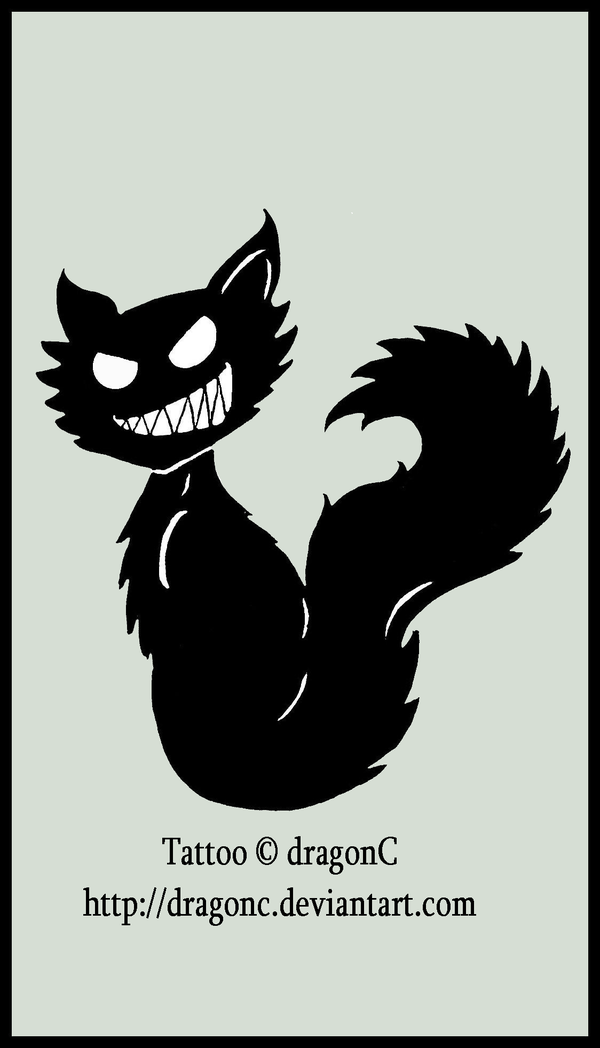
These were images for Sam the cat, to get a sense of his black evilness and his cartoon villainy.
These pics were images I’d looked at for Lucy, the main character:


Lucy was always modelled a little bit on Dot Cotton from Eastenders, but I also wanted Lucy to be a little bit like Holly Golightly from Breakfast at Tiffany’s, as if she’d just grown old but never really changed.
And a final few images:
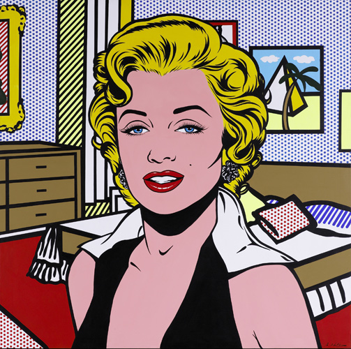
custom pop art printed on canvas


Here we have a picture of Margaret Thatcher, a major presence and character in the book – and whose styling Lucy emulates. And two pieces of art. First a Roy Lichtenstein for the pop-art element, and finally the 1960s cartoon styling in the Pink Panther advert. Note the elements similar to Holly Golightly – the cigarette holder and the upper class style.
The big issue here is that I didn’t give any comments about what the cover should look like. I simply shared the images I’d used, and the styles I liked.
So here’s the first draft cover that came back:

Sympathy for the Devil initial draft cover image, (c) 2015 Bodil Juline
Note how all the elements are drawn together.With this we could enter a more productive relationship of feedback and drafting. My first feedback centred around the following comments: could there be more contrast in the colours, and could we keep Lucy’s face more mysterious – following established advice that a face helps sell covers, but the whole face shouldn’t be shown. (This face is also, of course, Dot Cotton from Eastenders, so we had to find a way of disguising that slightly.)
Bodil came back with a couple of fresh drafts:

Sympathy for the Devil draft cover images, (c) 2015 Bodil Juline

Note the colour variations and the stronger use of Sam the cat, whose eyes draw you in.
We talked about the background and foreground colours, and went with this as the next draft. Here Lucy has lost her fur, because the artist felt it didn’t look right, so I went with her decision.
Sympathy for the Devil penultimate draft of cover image, (c) 2015 Bodil Juline
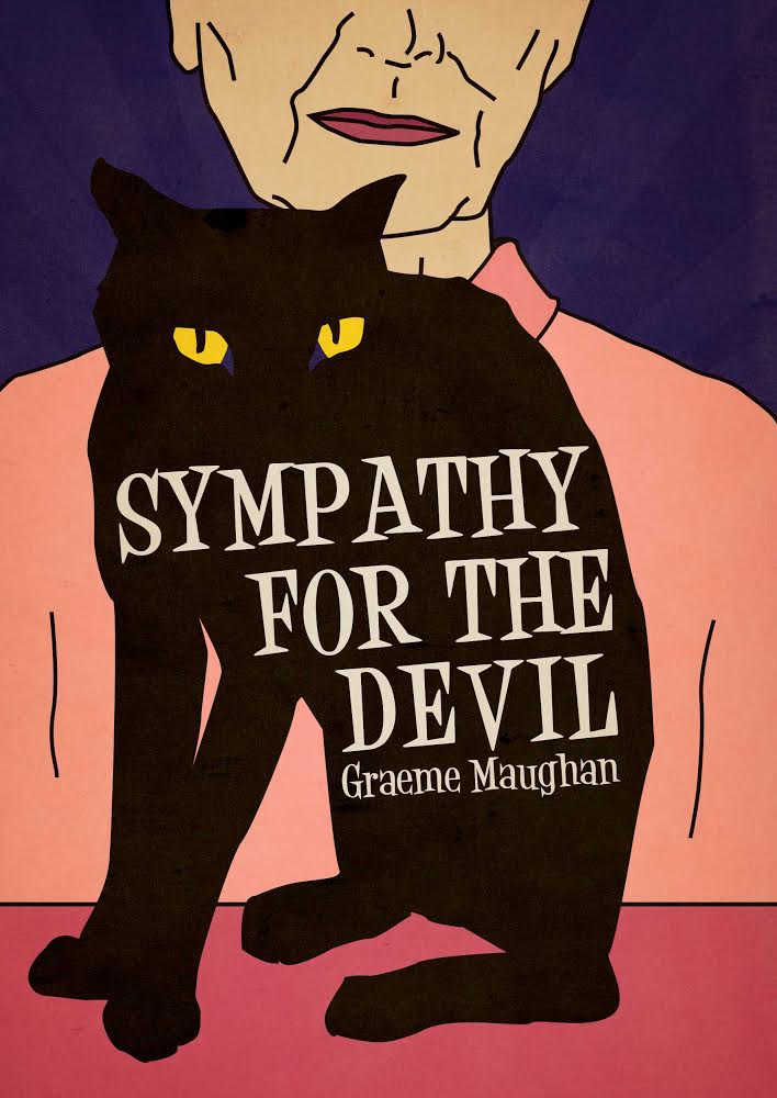
This is almost finished. I shared this image with a friend who works in graphic design, who gave me two pieces of technical feedback. In the final image you’ll see that the font is slightly smaller, and Lucy has an enigmatic Mona Lisa smile. Lucy’s upper face is missing, so we don’t have her eyes to work out what that enigmatic smile means. But we do have Sam’s eyes – and in the novel Sam is her familiar. So what we see on the front cover is now a clue to the book and Lucy’s character.
Here’s the final image:

Sympathy for the Devil final cover image, (c) 2015 Bodil Juline
